.svg)

Why Most SaaS Website Designs Confuse Users Instead of Converting
Date Published

January 20, 2026
Time to Read
.svg)
5 min
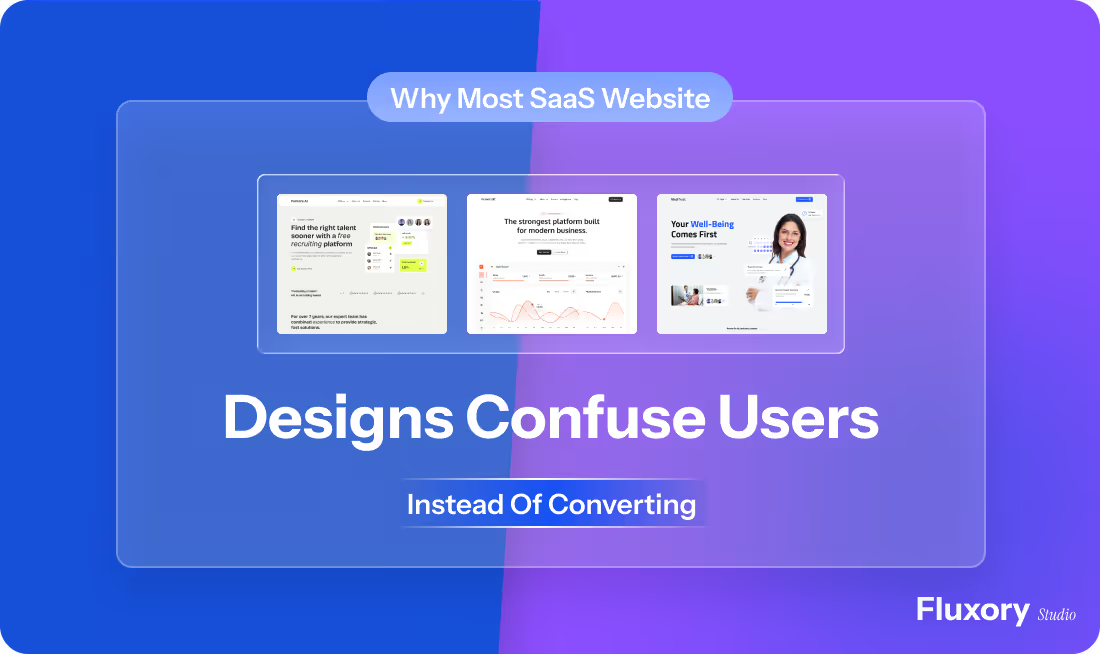
Most SaaS websites look modern, polished, and expensive. Yet many of them struggle to convert visitors into sign-ups, demos, or trials. The issue is rarely traffic. It is usually design choices that confuse users instead of guiding them.
These problems are not always obvious. They hide in layouts, copy structure, navigation, and assumptions about how users think. In this article, we will break down the most common SaaS website design mistakes and explain why they hurt conversions, even when the product itself is strong.
Why SaaS Website Design Is Harder Than It Looks
Designing a SaaS website is different from designing a brochure or portfolio site. SaaS users arrive with questions, doubts, and limited time. They want clarity quickly.
A good SaaS website helps users understand three things fast:
- What the product does
- Who it is for
- Why it is worth their time
When design gets in the way of these answers, confusion replaces confidence.
The Most Common SaaS Website Design Mistakes
Trying to Impress Instead of Explain
Many SaaS websites focus heavily on visual effects, animations, and clever layouts. While these can look impressive, they often distract users from the core message.
When users cannot immediately understand what a product does, they leave. Clear messaging always converts better than complex design.
Weak or Unclear Value Proposition
One of the biggest SaaS website design mistakes is hiding the value proposition behind vague language.
Phrases like “All-in-one solution” or “Next-generation platform” do not explain anything. Users need specific outcomes and problems addressed, not buzzwords.
If your main message does not answer a real problem clearly, design alone cannot fix it.
Overloading Users With Information
Some SaaS websites try to explain everything at once. Features, benefits, integrations, testimonials, and pricing all compete for attention on the same page.
This creates cognitive overload. Users feel overwhelmed and postpone decision making, which often means leaving.
Good SaaS website design prioritizes information and reveals details gradually.
Poor Navigation and Content Hierarchy
If users struggle to find features, pricing, or use cases, conversions suffer.
Navigation should feel obvious, not clever. Important pages should be easy to access, and content should follow a logical order. Many SaaS website design mistakes come from ignoring how real users scan and read pages.
Designing for the Team Instead of the User
Internal teams often know the product too well. This leads to assumptions that users understand terms, workflows, or acronyms.
A SaaS website should be written and designed for someone seeing the product for the first time. When internal language leaks into design, confusion increases.
How Confusing Design Directly Hurts Conversions
Confusion creates friction. Friction kills momentum.
When users have to think too hard, scroll too much, or guess what to do next, they hesitate. Every hesitation reduces the chance of conversion.
Clear SaaS design reduces decision fatigue by guiding users step by step. It answers questions before they are asked and removes doubt instead of adding it.
What High-Converting SaaS Websites Do Differently
They Lead With Clarity
Strong SaaS websites explain the product clearly within seconds. The headline, supporting text, and layout work together to communicate value, not show off design trends.
They Match Design to User Intent
Different users arrive with different goals. Some want to learn, others want to compare, and some want to buy.
High-performing SaaS websites design pages around these intents using feature pages, use case pages, and clear calls to action instead of forcing everyone into the same path.
They Use Design to Support Decisions
Every section exists for a reason. Design elements guide attention toward actions like signing up, booking a demo, or exploring features.
Nothing feels accidental or decorative.
Why Webflow Works Well for SaaS Website Design
Webflow gives SaaS teams flexibility without sacrificing structure. It allows designers to build clean layouts, scalable CMS pages, and performance-friendly websites.
However, Webflow alone does not guarantee conversions. The same SaaS website design mistakes can still happen if strategy is missing.
When Webflow is used with clear structure, focused messaging, and conversion-driven design, it becomes a powerful platform for SaaS growth.
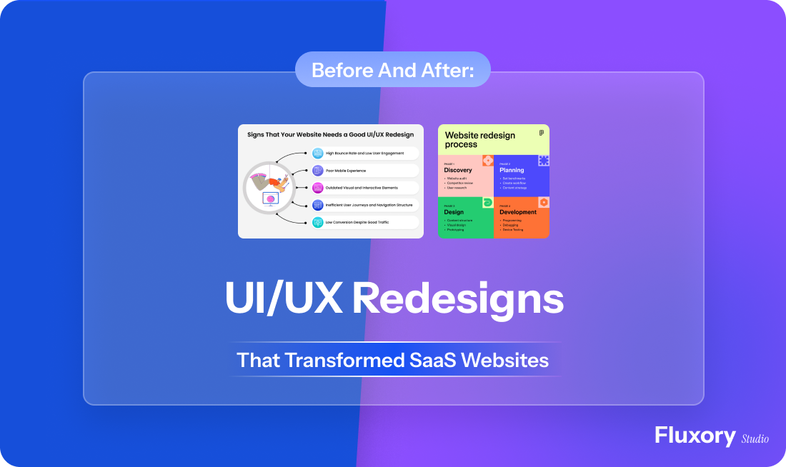
How to Avoid SaaS Website Design Mistakes Early
The easiest way to avoid confusion is to design with intent from the start.
This means understanding your audience, mapping their journey, and building pages that answer real questions. Design should simplify decisions, not complicate them.
Whether you are launching a new SaaS website or improving an existing one, clarity should always come before creativity.
Need Help Fixing Your SaaS Website Design?
If your SaaS website looks good but does not convert, design clarity is often the missing piece.
We help SaaS teams build and improve websites using Webflow website design services and conversion-focused Webflow templates. Whether you need a custom design or a ready-to-use template optimized for SaaS, the goal is the same: reduce confusion and increase conversions.
Conclusion
Most SaaS website design mistakes are not technical. They are strategic.
When design prioritizes style over clarity, users feel lost. When it focuses on explaining value, guiding decisions, and removing friction, conversions follow naturally.
If your SaaS website is not performing as expected, the problem is often not traffic or pricing. It is design choices that confuse users instead of helping them decide.
Fix the confusion, and conversions will take care of themselves.
Other Blogs

.png)
Build your next Webflow system with Fluxory Studio


.svg)
.svg)